This quarter the S&P 500 was up 1.1% or about 35 points. That number does not give justice to the volatility we have been watching lately. In this letter we will outline some of the changes that have been going on behind the scenes and what it might mean for your accounts.
In the month of August, the S&P 500 had an average trading range of 1.43%. Even though the market finished up 1.1% for the quarter, the market fluctuated more than that every day in August. If you felt worn out at the end of that month, you had a right to. When you have huge intra-day volatility without the market going anywhere, it’s a sign of a change in leadership of the market. We have pointed out in previous letters that the leadership for this market has been growth stocks and particularly companies that grow revenue without making money. Lately the growth stocks are having problems, and there is an investor shift to look at value stocks again. We can see it in our model account. At the end of March our model account was up 6%. At the end of June, it was 10% and now its 14%.
We want to point out some examples of how extreme the gap has been between growth stocks and value stocks. We will use the Russell 1000 as our test case. For the Russell 1000 we ranked its 1000 stocks into five quintile groups. The first quintile was the most expensive stocks in the Russell 1000 and the fifth quintile was the least expensive. To get a long-term frame of reference on how these quintiles were valued, we looked at data going back to 1951. The average difference in the price-earnings ratios for the most expensive to the least expensive over the last 70 years was 25.5 (highest average P/E of 32.9 and the lowest P/E of 7.4). Today the difference between the most expensive stocks and the least is 61.3 (71.6 today for the highest P/E and 10.3 for the lowest P/E). Investors are now willing to pay over twice the 70-year average for growth. Some of you may say that’s justified because the more expensive stocks grow at a higher level, which is true. However, the market is expecting the most expensive stocks to only grow their earnings by 3.1% more than the least expensive stocks. Paying 71.6 times in earnings for a CHANCE at 3.1% more growth versus paying only 10.3 times for the slower growing quintile of stocks is a bad bet. At some point we think this ratio will revert to the mean difference in P/E’s of 25.5.
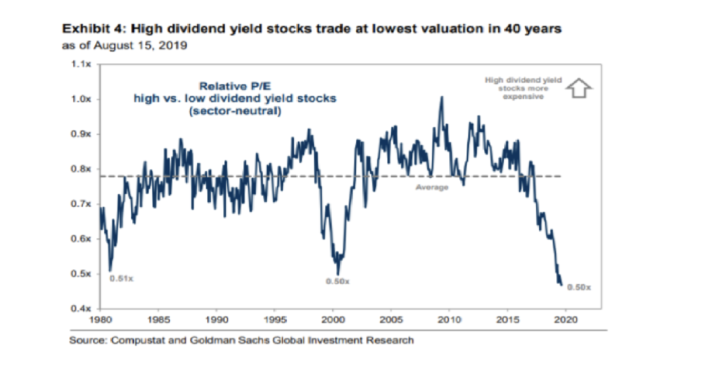
What about dividend-paying stocks? We have included a chart below this paragraph showing the relationship between high-dividend paying stocks and low-dividend paying stocks. As you can see in the chart, high-dividend paying stocks are the cheapest they have ever been versus low-dividend paying stocks in the last 50 years. We find this chart another indicator of investors’ willingness to overpay for growth. We all remember the English proverb: “Do you want to keep the bird in the hand or try to get two in the bush?” Today the bushes are winning big time. We have a lot of high paying dividend stocks that have been affected by this. We are rooting for the bird in the hand to make a comeback.
Before we leave the subject of valuation extremes, we want to post some data from 2017 that we find fascinating. This trend continued into 2018 and may finally be ending.

The chart above shows all the major equity indexes and how they performed in 2017. To help investors see which groups did the best inside these indexes, they divided the stocks into the largest market capitalization stocks to the smallest. We want you to focus on the largest five market capitalization stocks (column 3) and the smallest quintile stocks (last column). Because most of us are familiar with the S&P 500 index, let’s use those numbers to highlight what’s going on with the index crowd. Inside the S&P 500 in 2017, the five largest market capitalization stocks went up 45.3%. The smallest stocks were down (1.1%). If you look at the rest of the popular indexes, it’s a similar trend; the larger you are, the more your stock went up. The smaller you are, you struggled. The performance gap between large-cap- index stocks and small-cap-index stocks was in some cases over 90%. Why does this matter? What does it mean?
The trend in investing right now is to index to a select group of stocks (S&P 500, Russell 2000, etc.). Active managers are being liquidated and the money is being placed in index funds to own 500 or 1,000 stocks versus just 20 or 50. That sounds good in theory, but as the previous paragraph pointed out, something is going wrong with the execution of the indexers. There IS NO WAY if you are indexing according to market capitalization that the largest stocks IN ALL OF the indexes are doing 58% better than the smaller ones fundamentally. As you can see from the chart it’s a worldwide phenomenon. In theory when you put $1,000 into an index fund, the money would be split according to the market capitalization of the stocks equally. This would make it where if the index is up 20% for the year, ALL STOCKS in that index for the most part would be up the same amount regardless of whether they were large cap or small cap. We know that did not happen in 2017 because the large-cap stocks were up on average 58% more than the small caps. What does it mean?
We think that the indexers and those who mimic them are not actually indexing. They are looking to buy SOME stocks in the index but not all of them. The primary determinant of what they buy in the index is stocks with liquidity that they can trade quickly. This would explain why the five largest liquid stocks are trouncing the less liquid stocks. Liquidity is more important than earnings or valuations. The indexers are “bending” the rules to accommodate the trading flows of Wall Street. What it means to us is that there is value in smaller stocks versus larger stocks even though they are in the same index. We get asked the question a lot: Is the market overvalued? We usually answer it by saying it is overvalued by about 10% to 15%. What would be a more accurate answer is the market is overvalued for large cap-stocks and undervalued for small-cap stocks. When (not if) there is a market correction, the large liquid high- capitalization stocks that everyone is buying in the index today will be hit the hardest. Most of those are the large technology growth stocks instead of the value stocks we own. You want to be very careful owning the five large-market-cap stocks in any index. You would have done amazingly well if you only own the five largest stocks of every index, but it won’t last. They will be the first stocks sold when “passive” index money flows the other way.
We have written about these extremes in the market to help you understand why we are fully invested in a market that is statistically overvalued. Most of our positions are not in the “favored” categories of high revenue growth, high price-earnings ratios and low dividends. We feel when that group gets liquidated, the money is going to come our way (like the dot-com top of 2000). Hence, we are willing to sit through the ups and downs of August waiting on a reversion of the mean to historical standards. We are currently looking at investments in small-cap value stocks to increase our bet on a reversal of these trends.
We want to finish this letter with a brief comment on the economy. The yield curve has inverted (short rates are higher than long rates) and the investing world is concerned. The yield curve usually inverts when we are heading into a recession. We don’t see a recession happening in the U.S. this year, but we do think Germany and China are in one now. Their economies are the biggest victims of the trade war going on with our president. Depending on how they react to this recession will determine whether the U.S. goes into one next year. If they decide to not increase the consumption of their citizens by decreasing the value of their currencies, or by not running fiscal stimulus, it will be hard for the U.S. to grow very much in 2020. If they stimulate their economies, then the U.S. will do OK next year. As of this writing it’s too early to say what they will do. The interest rate on a 20-year German bond is negative 25 basis points. That means investors are comfortable locking in a quarter-point loss every year for 20 years for the privilege of owning a German government bond. For the world economies to function well, that must end.
Our holiday party will be on Thursday, December 19. Please save that date. Kelly will be sending out the invitations the last week of November. Don’t forget to RSVP.
Sincerely
Mark Brueggemann IAR Kelly Smith IAR Brandon Robinson IAR